
Table Visual
Visualize, summarize, and analyze metric data across different groups and time periods.
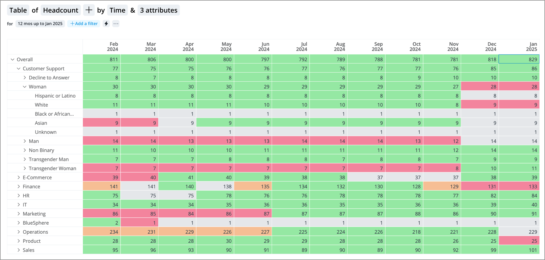
The Table visual presents large amounts of information in a structured and user friendly format so you can quickly discover patterns and insights.
Using the Table, you can:
- Summarize and report on relevant data by filtering, sorting, and grouping.
- Compare metric values across multiple dimensions (groups and time periods).
- Switch rows and columns to view and work with your data in a different way.
- Drill down to explore different levels of your data to get more detail.
For more information, see Build the Table Visual.
Tip:
Right-click on a chart item or data point to open the Visual Item Actions menu. Find actions that will allow you to quickly interact with points of interest. Actions include drilling up or down to view different levels of your data and accessing the Detailed View visual to see a list of subject members or event occurrences that make up a given population.
The Table is composed of:
- Columns
- Rows
- Cells
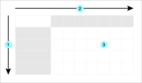
Each cell contains the metric value at the intersection of the row and column.
Note:
- The Table can contain up to 100,000 cells.
-
When downloading data as a spreadsheet or consuming a Data Export, null (N/A) values in the visual will appear as blank (empty) cells in the destination.
In this section